Introduction
Tropology is an experiment in visualizing conceptual networks from TVTropes. The initial idea was that, starting from a chosen concept, we could visualize the list of tropes and articles it referenced, along with the relationships between them.
Experimenting with the data, which even after some judicious pruning includes over 220 thousand nodes and 11 million relationships, led me to quickly conclude that the model was too widely connected. We couldn’t just visualize the raw data and needed to apply some sort of direction in order to make the visualizations sensible.
Let’s see how to go about that.
The problem
The connections between nodes are too dense, so when we try to visualize even an average page for an anime show we end up with a very large graph. Labels would be unreadable at this density, so here’s the graph zoomed out.
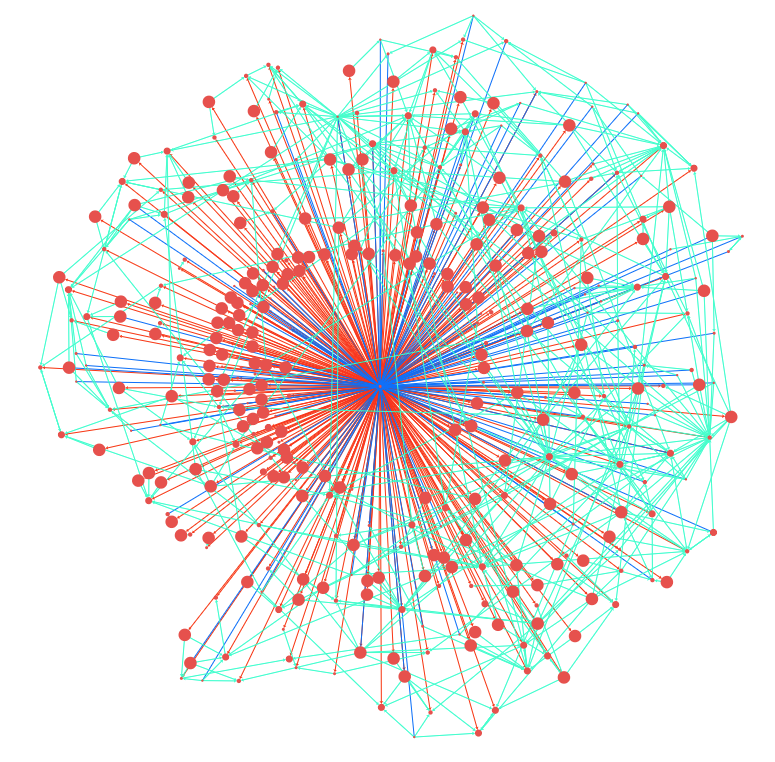
Red arrows are outgoing links, blue ones are incoming, and teal are relationship between concepts that are related to the central one.
It’s interesting enough in the abstract, and perhaps we could use this to generate graphs of different articles and see how they compare, but it quickly becomes impossible to read for relatively central concepts. On those, the graph ends up being a mass of teal links overdrawing everything else.
I experimented for a while with being able to zoom into a conceptual neighborhood, showing the shared concepts between two nodes. This yielded some more interesting results, but the graph was still predominantly filled with central “hub” concepts, its density drowning out smaller ones.
More importantly, it had the disadvantage that it only helped if you knew what what you were looking for, in practice removing any discovery factor that could surprise the user.
Going for discovery
With this, I decided on an alternate approach. The whole reason why there is such a thing as a TV Tropes link warning is because people go there to read about a topic, then get lost in a chain of references they find interesting.
Could we mimic this behavior, then see what the graph looks like when as the user is exploring?
A TV Tropes article is a (usually) collection of standalone references to other articles, along with a description of why they are relevant. These can be parsed off the page’s contents and, since the URLs to other articles follow a standard format, interpreted before we display them.
With this new approach, we first start off a concept, say Evil Gloating.
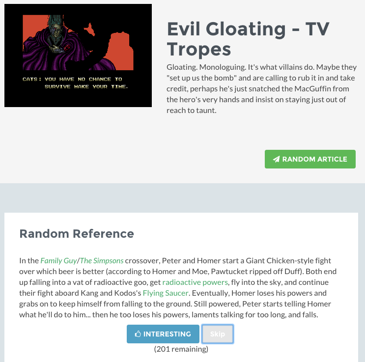
Right there we show the user a brief description of the concept itself, along with a random reference from the page. This reference is not just a link, but the actual text description.
The user can decide if he likes the reference, which adds it to a list, or to skip it. If skipped the reference is gone forever, to encourage the explorer to consider his decision.
Alternatively, he can also click on any of the references the snippet links to, which both adds the reference to the liked list and loads the new topic.
The explorer can of course remove references he’s found interesting at any point.
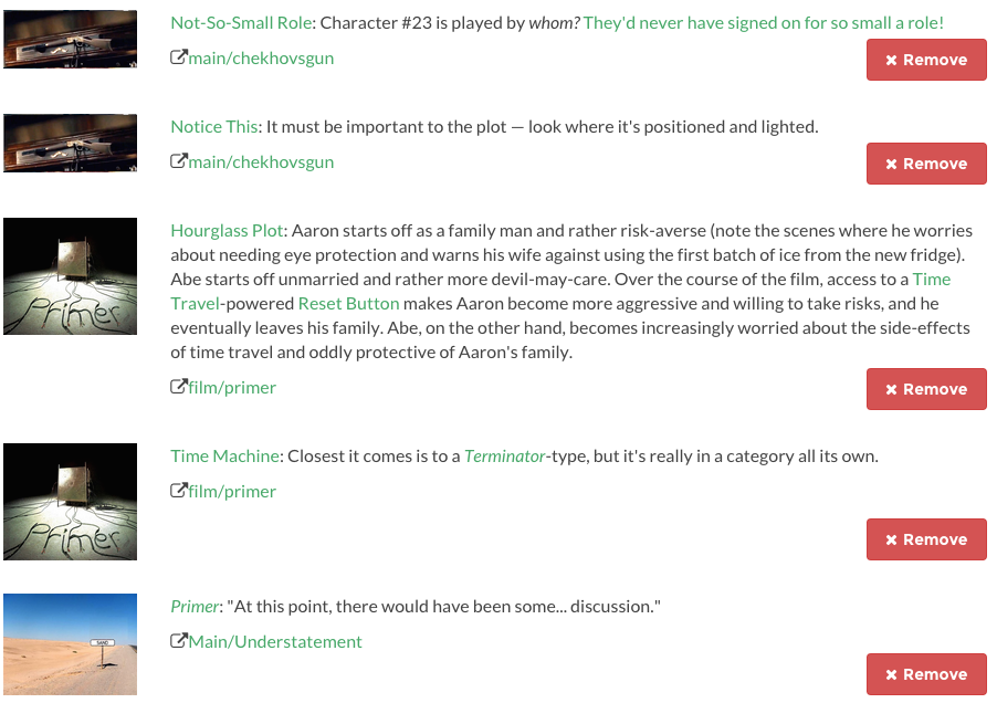
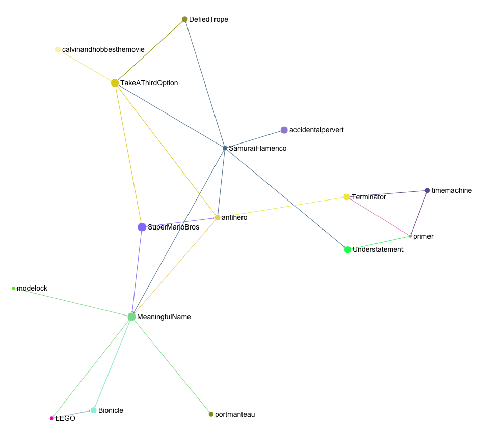
After a while of exploring, we end up with a list of concepts the user as found interesting. For example, here we arrived at Take a Third Option by way of exploring concepts from the anime Samurai Flamenco.
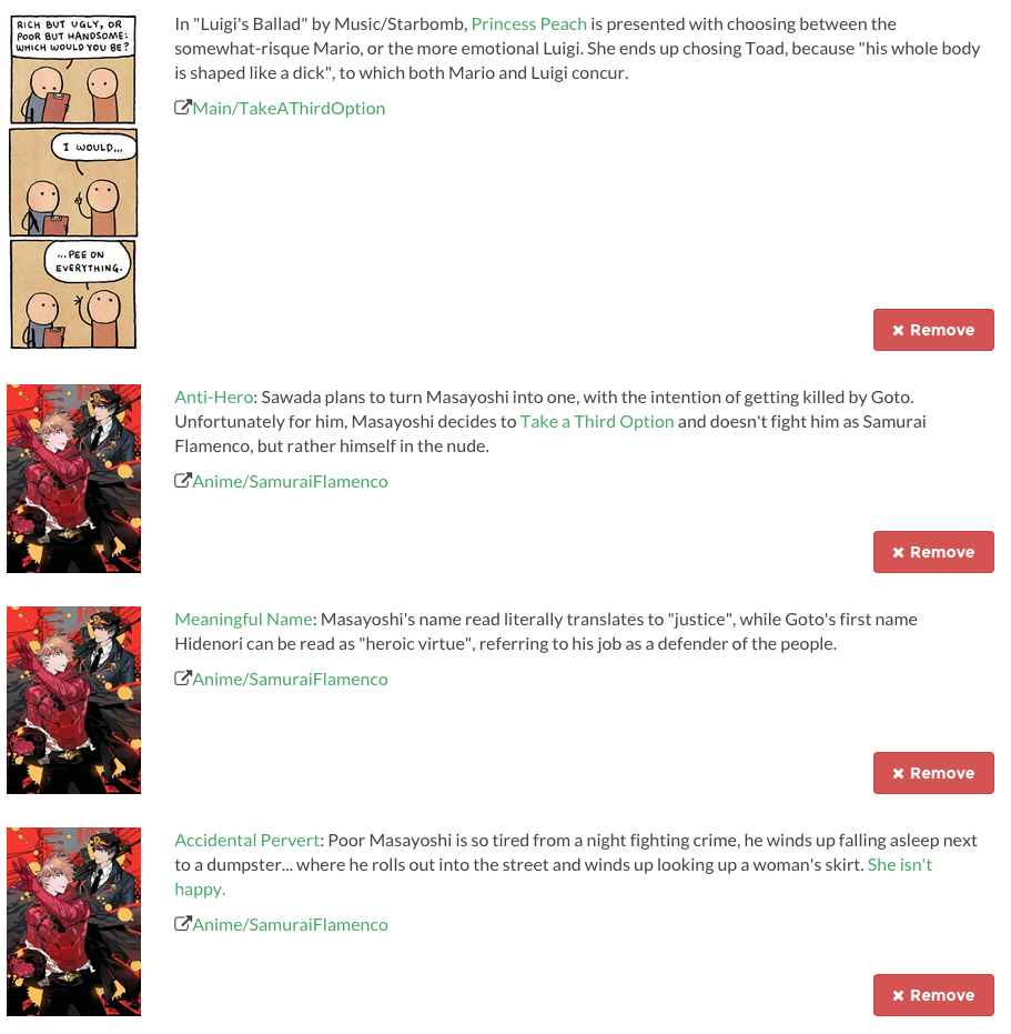
This eventually lead to the brilliant, bizarre science fiction movie Primer, which has some relationships to Terminator and other concepts on the references we liked.
Graphing it out
It gets really interesting is when we start graphing out the user’s meanderings through the site. For instance, this is the graph of references up until when we have added the links to Primer:
For ease of reading, arrows have the same color as the node they emerge from.
Notice that Terminator and Time Machine are in there, even though we never went to their concepts, because we have liked references that link to them. Primer is pushed to the outside of the graph, because Terminator is related to AntiHero, which is also linked from our starting concept.
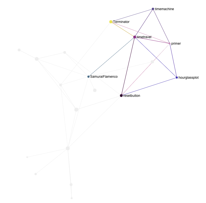
If we want, we can also visualize concept islands by clicking on any node, which will show us those immediately related to it. These are the references that link to Time Travel, among those that we have liked.
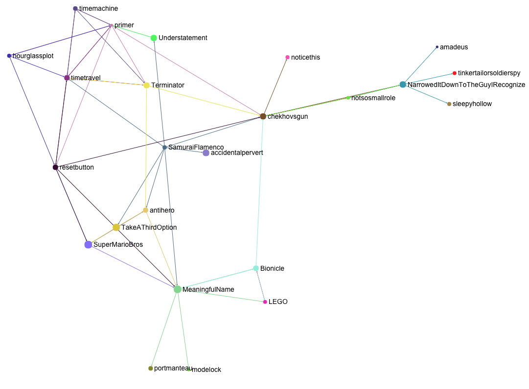
A huge advantage of this approach is that even if we add a central, widely referenced concept, it will not crowd out the graph. That is because we now only include it in as much as it relates to the concepts the user has expressed an interest in, not the entire system.
Imagine that while exploring Primer a reference to the much-mentioned Chekhov’s Gun catches our interest. We add it to our graph.
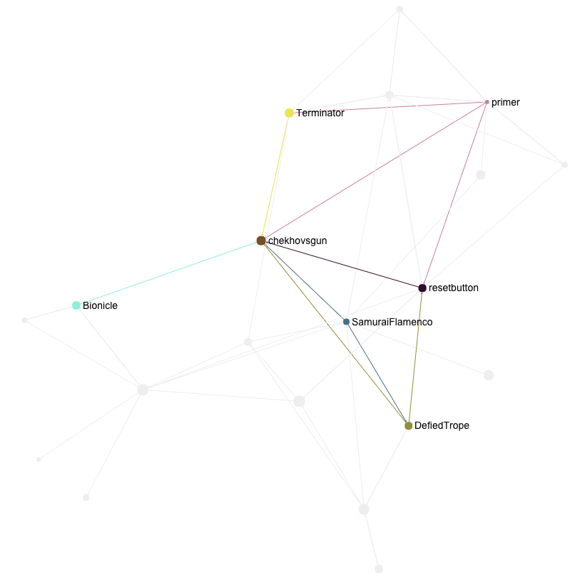
The concept does acquire a central position, given how connected it is, but it does not overwhelm us. If we go on a tangent of concepts related to Chekhov’s Gun but not necessarily linked to the ones we have liked, this is properly represented by pushing the it to the periphery.
The code
If you’re curious about Tropology, the Clojure code is out on Github. It includes Sigma.js for the graph visualization, and has other requirements which are listed on the README.
I intend to do a technical write up of the experience on the Clojure and ClojureScript side of things, which will come in a couple of weeks.
Conclusion
I’m much happier with this approach, which creates a graph of things the user actually has an interest in, while letting him see how they all relate. I’ve found that the people who try this version are more involved on what’s actually going, adding and removing concepts to see how things relate to each other, leading to playful exploration.
Turns out that in order to generate better concept visualizations, all we need to do was give the user a way to express their intent. There is no replacement for actual engagement.